Back to Basics
Using simple concepts to create exceptional design.
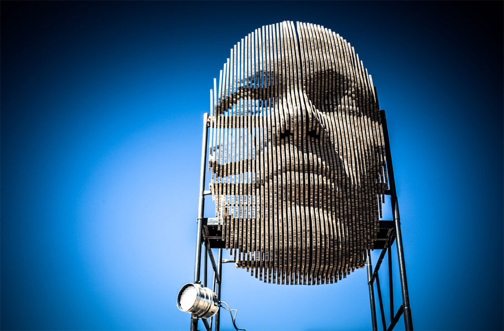
Overengineered or pushing the board to its limits, are phases that have been finding their way into the Xanita corridors more and more of late. Now there is nothing wrong with pushing the limits and redefining what we believe is possible with Xanita board, if anything it’s necessary, but we also need to occasionally take a step back and go back to basics to solve design challenges.
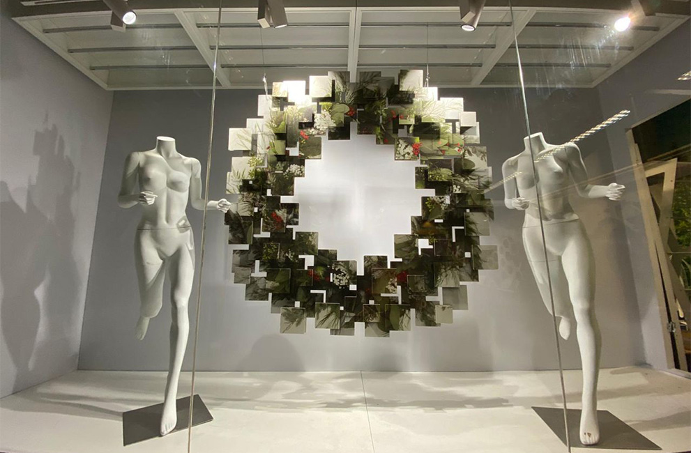
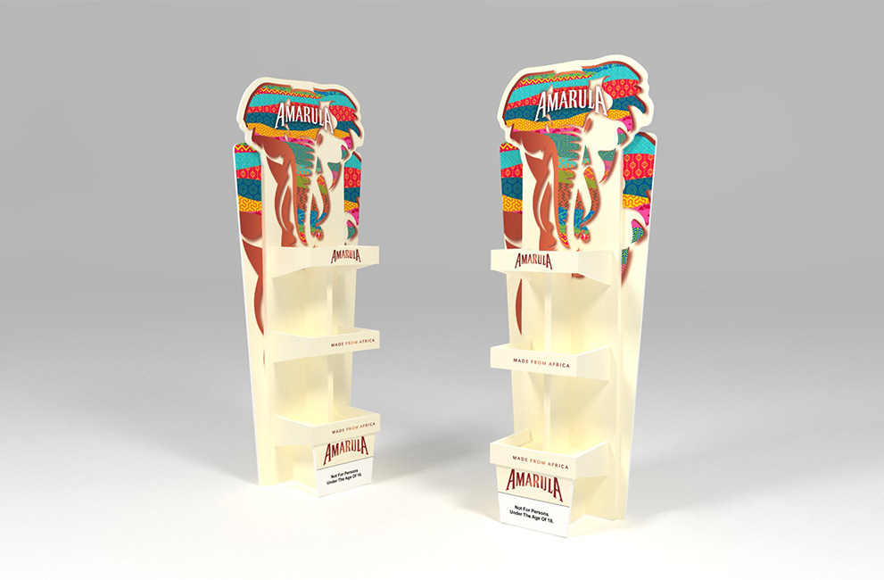
It was the recent shop window wreath done by Imageco in the UK that did such a great job to remind us of this fact. A series of simple printed squares cut-out and arranged to create an eye catching three dimensional display, is a great example of a simple concept beautifully executed to create something spectacular.
“Visual design elements and principles describe fundamental ideas about the practice of good visual design.” — Wikipedia.
As a matter of fact there has been a noticeable organic shift in design in general to simpler and minimal aesthetics. These minimal designs may look unfinished, or plain, but they’re actually rather complex, and can be difficult for a designer to pull off without practice. Designing with restraint requires exceptional attention to detail, and a good sense of when enough is enough. A lot of thought is involved in deciding the most important elements of a design and knowing when it’s time to lose the gimmicks.
With the right concept and perfect execution less can definitely be more, in a world full of complexity and chaos, it stands out as a visual dose of sanity and draws attention to what really matters your product, showcase or brand.
So how do we achieve this?
Acknowledge the importance of simplicity. We’re all familiar with the phrase “less is more”. In this context we’re talking about eliminating complex cutting, unnecessary printing and over engineered design.
Focus on fewer elements. What is it that you want to highlight? Do you have a fantastic product to sell or a service that is worth highlighting? Can it be presented on its own or do you need to create a universe around it? Pick only the essential elements, these could be one or more of the following; colour, typography, images, text, graphics, form or contrasts.
Get straight to the point. Bombarding your people with too much information, images and colour can keep their focus away from what you offer. With a simple and elegant design, you can concentrate on the content that you would like to highlight, allowing people to better understand what it is that you offer. It provides a better visual flow – the more negative space you have around information that you want attention to, the more the eyes will be drawn to it.
Maybe it’s time to ditch the overcomplicated gimmicks in favour of something simpler and more refined?