
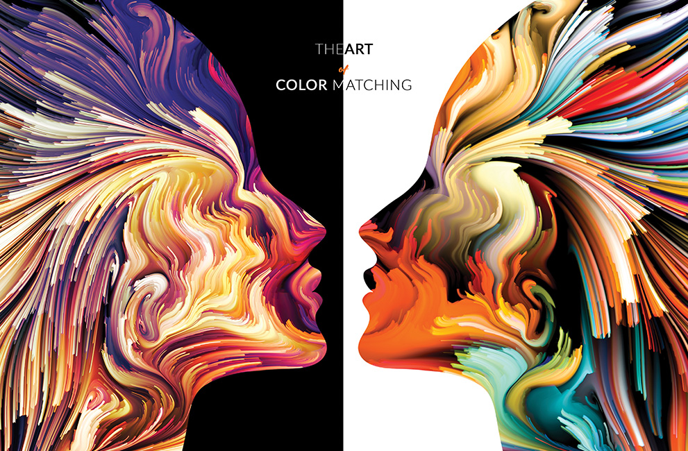
The Art of Color Matching
What is color matching?
It is a process of transferring color across different technologies or platforms, ensuring that the colors you see on your screen are accurately recreated when they are printed.
The importance of color matching cannot be understated, yet the growing number of ‘designers’, ad agencies and printers nowadays who are either unaware of, or not as competent as they should be in it, borderlines on the comical.
“But it looked okay on my screen”, “the client approved the test print over whatsapp”, “the client said we should just pull their logo from their website”…are just some of the comments I’ve overheard in my travels in the last couple of months. The underlying topic of all those discussions being around an issue with the color of the print.
Most of us have experienced issues with getting colors in print to match what’s on our screens at some point. It can be incredibly frustrating troubleshooting a problem especially if colors have been carefully considered, profiles are accurate, or a job demands a specific color that is difficult to hit on a given substrate.
So why do we have this problem? The short, grossly simplified answer is your monitor uses bright punchy RGB color and your printer uses more muted CMYK color. This change in color system leads to changes in the visual reproduction of the image, if this isn’t accounted for then you are left with discrepancies between the screen image and the print image.
There are a lot of articles out there that talk about simply choosing the right paper or substrate to print on to get the right color, but in reality this is not really a solution. If you’re printing professionally, it’s not always an option to swap out the substrate you’re printing on. This ‘solution’ also fails to address the fact that if the color is wrong, then it’s wrong, it doesn’t matter how pretty the print looks.
So how do we fix it? Fortunately there are some relatively simple steps you can take to improve your color matching. They will reduce the amount of proofing you need to do and help you avoid delays in delivering jobs to clients.
Following these steps will help you get color accuracy in your print projects, every time.
Reduce Glare
Pretty obvious and straightforward, avoiding monitor glare is a necessary first step. Some of the most common color matching problems can be easily solved by improving your working space.
Unnecessary glare on your monitor, dark or overly bright conditions, and even the angle at which your screen is viewed can all affect color perception, leading to unexpected results when work is printed.
Always try to view your screen straight-on, as color reproduction varys with most monitors once you move a few degrees off-centre either horizontally or vertically. Remove any light that causes a glare on your screen, because it may affect the way your eyes interpret color.
Your Monitor
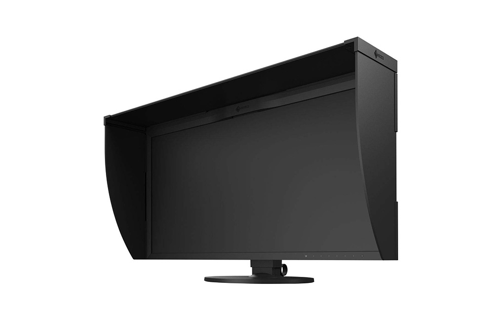
If you are designing and printing, then you really should be investing in a decent monitor. The Eizo ColorEdge is pretty much the Rolls Royce of monitors, but at a whopping $2500~$5000, it is not for everyone.
The reality is that even if you don’t buy an Eizo, you’ll still need to look at the top end of the monitor spectrum. Dell, Philips & ASUS all have really solid options, but you’re still looking at prices ranging from $500~$1500.
The limitations of monitors at the cheaper end of the market that will directly impact on your ability to accurately predict print results, and in turn your business. You might save upfront with cheap low-end monitors, but their inability to reproduce color accurately across the entire gamut, will create obvious artefacts and color-banding in dark areas.
Check your eyes
Do you wear glasses? Do you need to? Is your prescription up to date?
Your personal color perception is more important than you realize. It’s common for one eye to be more sensitive to particular colors than the other. Not keeping your prescription up to date or wearing glasses when you need them, can not only cause eye-strain but also affect your ability to judge contrast, brightness and color.
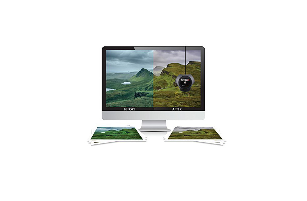
Calibrate!
Is your screen accurately reproducing colors?
The best way to do this is to calibrate your screen. There are lots of ways you can do this, but the easiest is to buy yourself a calibration tool such as the Spyder5ELITE.
These devices work by measuring the ambient light in your workspace as well as the light emitted by your screen, adjusting the color space your monitor works within to compensate for both factors and to reproduce accurate colors. This takes all the guesswork out of calibration and makes the entire operation as simple as clicking a button & following the instructions on screen.
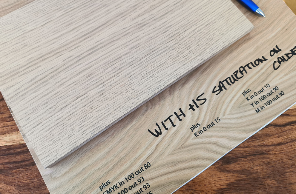
If you can’t afford a dedicated device, then make use of your printers built-in calibration tool. It prints sheets with blocks of color and asks you to judge which is closest to a color shown on screen. You repeat the process until your printer is reproducing accurate results. (this will only work with that specific printer).
The right color space
Almost every computer uses sRGB by default, installing any apps from Adobe will introduce AdobeRGB, and should have various CMYK color profiles.
Set up your system to use specific color profiles appropriate color profile for your intended output device, rather than relying on the pre-installed profiles, you’ll avoid common color issues and be better off in the long run.
Soft-proof
Most design software has soft-proofing options to allow you to preview your work in a simulated print environment on-screen. Simulating the printed look allows you to get a semi-accurate idea of how the final printed work will appear.
Talk to your printer
If you aren’t printing yourself then this applies to you.
To ensure accuracy always provide reference material. If you’re attempting to reprint something you’ve previously sent to printers, or trying to match an existing piece of collateral, provide them with a sample of the previous work so they can color match on their end.
This is vital if you’re doing large runs or complex jobs, Generally printers won’t have an issue with you providing samples for color matching on bigger jobs.
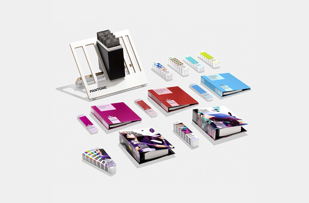
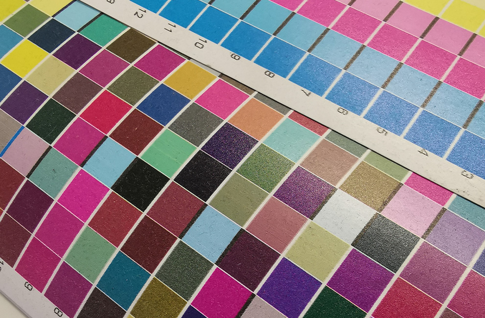
Use a color library
Yes it’s expensive, especially if you’re a smaller business, however the Pantone system offers a fixed color reference to ensure perfect color reproduction across different media and print runs.
For color-critical applications, such as branding where accurate color reproduction is essential, the expense is worthwhile, especially when you can show your clients the exact color their print will use.
You can also use the approximate CMYK and RGB reference equivalents to accurately pick colors without going to the expense of printing a fifth color.